A Tale of Two Users
Six Degrees Society is a networking company that provides in person networking events and networking memberships. Established in New York City, Six Degrees recently expanded to San Francisco. The company would like to better understand how to meet the needs of its San Francisco users, and improve the overall usability of its website.
Key Research Questions:
1. What are the differences between San Francisco and New York users, in terms of networking preferences and pain points?
2. How might we increase the user experience of the website to improve clarity and flow for it’s users?
3. What are users looking for in a networking membership and how might Six Degrees Society meet these needs, as evidenced by an increase in acquisition and retention of members?
Methodology
This research project calls for a combination of generative and evaluative methods, to understand the needs of users in the new market (San Francisco) as well as improve the usability of the website, which serves both San Francisco and New York customers.
1. Conduct surveys and user interviews to gain qualitative and quantitative data on the preferences and pain points of target users.
2. Conduct usability testing and heuristic evaluation with target users to improve the clarity and flow of the user experience.
Surveys and User Interviews
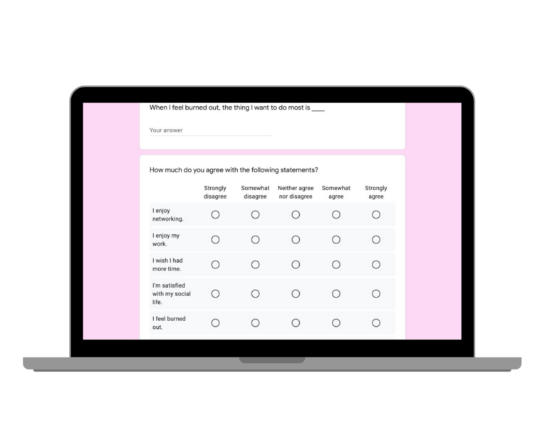
Online surveys were created in Google Forms and disseminated through online groups and social media. Interviews were conducted remotely over Zoom.
Demographics
- Adults in New York City and San Francisco
- Gender: Women
- Ethnicity: mixed
Interview Flow
User Feedback
Who are these users?
Not surprisingly, more SF users work in tech, while NY users work in a variety of fields (healthcare, design, education).
New Yorkers and San Franciscans are equally stressed, busy, and burned out.
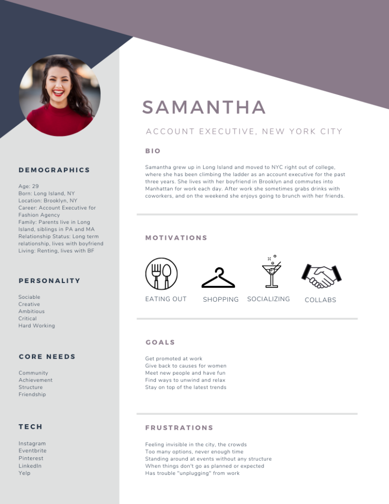
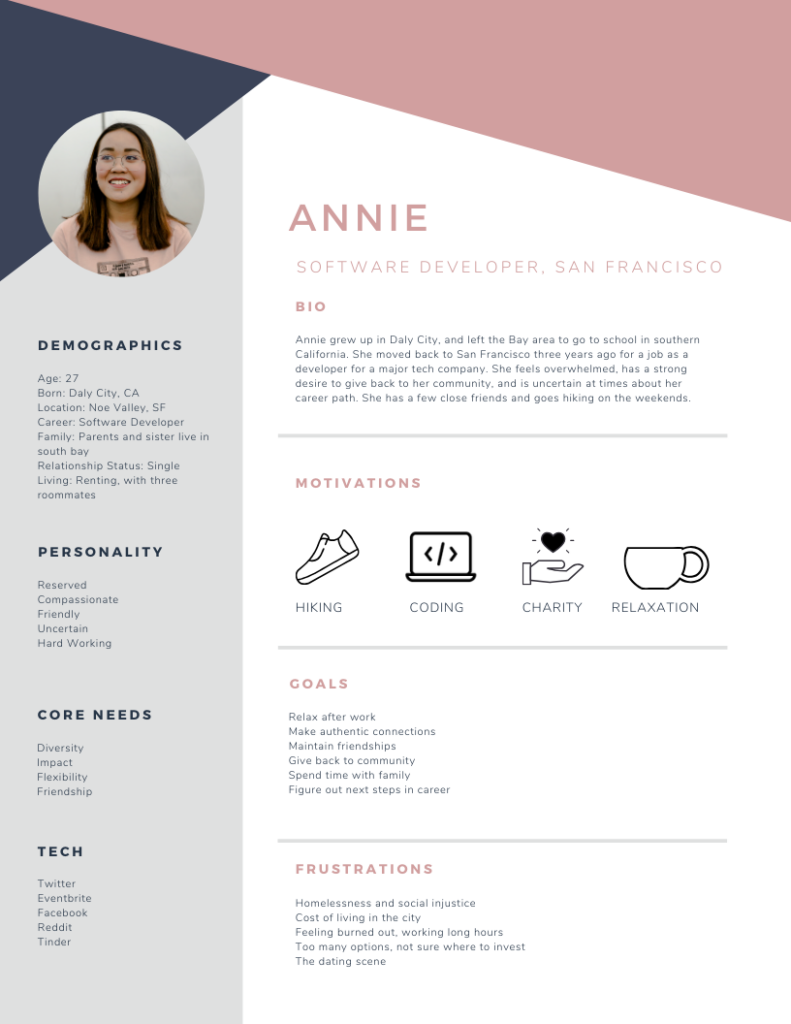
Feeling Invisible vs. Feeling Overwhelmed – Different Cities, Different Pain Points
When asked about favorite and least favorite aspects of living in the city, New Yorkers had more positive things to share about the metropolis they call home. Survey respondents listing all the people, opportunities, and diverse experiences as highlights of city living. The common theme for New York dwellers was that the downside is overcrowding. One respondent stated they felt like “just a number” at times.
San Francisco respondents appeared to have a much more conflicted relationship to where they live. San Franciscans spoke about the homelessness, social inequity, and dirtiness of the city. Many respondents also mentioned that the cost of living is unreasonably high. As one respondent stated, the worst part of living there is “How obscene the inequality is. The homelessness, the poverty, the income disparity and how overwhelming and complex the issues are to tackle…” SF dwellers frequently listed the ability to easily escape the city and spend time in nearby nature as a positive aspect.
More Similar Than Different: We Just Want To Chill Out Together
Despite the differences observed, SF and NY users agree on many things. They want events to focus more on relaxation and leisure than on strategy and learning. They prefer events in the evening on a weekday, and they appreciate having a diversity of events to choose from. Ultimately, most respondents wanted friendship over networking, or saw making friends and networking as the same thing. The women I spoke with and surveyed all want to meet people who share similar interests and hobbies, rather than only spending time with women in the same area professional background. There was a strong desire voiced by many users to meet people from diverse cultural backgrounds.
We Love The Company… Not The Website
Every current user I spoke with or surveyed found Six Degrees Society by word of mouth. Interestingly, all the users I spoke with had very positive feedback about Six Degrees Society and continue to attend events regularly, but stated that if they were to have found the company through the website alone, it would have been highly unlikely they would attend an event. Most users also stated that the website was confusing or even at times misleading. This is despite stating that they find the website branding to be appealing and professional. Additional usability testing was conducted with non-users to further identify the key problem areas.
Persona Development
I developed two personas to illustrate the differences and similarities between New York and San Francisco users.
Usability Testing
I spoke with target users (women living in urban areas) who had never before heard of Six Degrees Society, and observed them navigating the Six Degrees website for the first time. The following tasks were assigned:
1. Review the homepage without clicking. Share your thoughts and initial impressions as you navigate the page. Remember to speak your thoughts out loud.
2. Navigate the website to learn more about what the company has to offer. Based on what you observed, what does this company offer? Who is it for?
3. You decide to attend an event in person to see if you would like it. Please look at the events in San Francisco happening in the next two weeks and pick an event you would like to attend. Stop when you reach the payment page.
4. You are interested in becoming a member of Six Degrees Society. Find the membership options, review them, and select the option that most interests you. Stop when you reach the payment page.
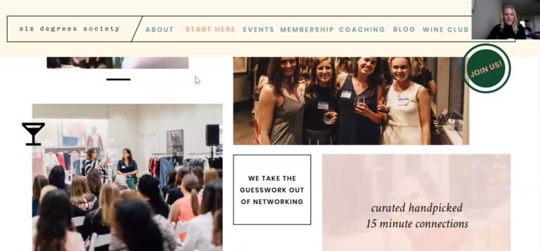
Screenshot of a user navigating the homepage.
Usability Feedback
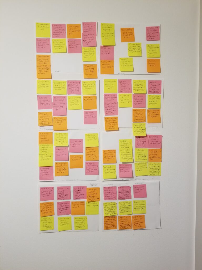
Homepage
- Users find the rotating images on the homepage catchy and appealing.
- There is too much text in the “Our Story” section. No one noticed the arrow to the right that continues the story onto another panel (missed opportunity)
- Users become confused and hesitant when navigating the Start Here section
Event Page
- All users had an aversive reaction to the italic text above fold asking them to download the app
- Users became frustrated when scrolling through the NY events to find SF.
- Users become confused after clicking on an event (taking them to a third party website), and express that they do not understand what a curated match is (indicating a lack of understanding about what they are signing up for)
Membership Page
- Users describe the overall feel of the membership page as “busy” and “confusing”
- Some of the content is unclear, such as the “monthly curated email” and the “blog post career profile”
About Page/Other
- Users become increasingly frustrated on the about page, mainly due to dead links
- The mailing list sign up form above the fold on about page is off putting to users
- The blog page header is confusing to users as it is different from the rest of the site
- The wine club page confuses readers, most complained about the amount of text
The following quote from a user summarizes well how the website frustrates and confuses the user. This user initially responded very positively to the branding and layout of the site, but became increasingly frustrated as the testing went on.
I really like all the options that they give you. But now that I've explored them more I'm a little confused. I'm not sure if we're just socializing, then there's coaching on there, there is a wine club, and there's memberships. So I'm not completely certain what they do, because there are just so many things... cut to the chase: what are we doing here?
Heuristic Evaluation
I completed a heuristic evaluation to synthesize the data and assess core usability heuristics. Items were identified and rated on a scale of 0-4, 0 being no usability issues, and 4 being urgent and severe usability issues. The following strengths and problem areas were identified:
Appearance/Aesthetics
The website employs a pleasing and consistent color palette. The branding was well liked by all users. Users noted that the site looked "clean" and "professional" with appropriate use of fonts, margins, and white space. The header was clean, with a simple and organized layout. Only one minor issue was noted, in that some images appeared clickable to users, but were not, while other text did not appear clickable, but in fact was.

Content
There were some content issues identified by users, most notably that there was too much text in areas, and a lack of bolding, sub-headers, and inconsistent image placement left users feeling overwhelmed by the amount of information. Many users had difficulty finding the information they needed, or this information did not appear to exist on the page. Frequently, important information could not be found above the fold, or was placed more than halfway down the page.

Efficiency/Functionality
One of the unique design challenges for the Six Degrees website is that the membership and events portal are owned by a third party company, VINT. However, this is not made clear to the user, and the portal links do not always open in a new window, which leaves the user uncertain how to proceed when they enter the portal. Proper etiquette is not always employed with external links, leading to confusion. There are also many broken links on important pages, particularly the About page.
Navigation
Navigation was by far the area most needing improvement. After leaving the homepage, there is no direct path back home. Clicking on the header logo leads to the about page, confusing users. There are two buttons on the main header that lead to the about page, and this page was the most frustrating and difficult to navigate. When entering the blog, the header format changes in both color, font, and style, making users uncertain if they are accidentally went to a new website. On numerous occasions users would look confused during testing, and state, "I'm lost," "I'm stuck," or "I don't know where I am now."
Summary of Findings and Recommendations
This research project aimed to help the stakeholders and design team understand how to build a product to serve both New York and San Francisco users, and to identify strengths and problem areas in the usability of the website.
Generative research indicated that San Francisco users are similar to New York users in many ways. Primarily hard working millennials, both prefer friendship and leisure over strategy and professional networking. There is a shared desire for diversity and giving back to the community. San Francisco users are more overwhelmed and conflicted about the city they call home. However, at the end of the day, the similarities outweigh the differences, and all users I spoke with indicated that what Six Degrees Society offers is appealing to them. The only concern regarding the service itself was that the memberships do not appear to offer a significant value over the cost of attending events one at a time. This is likely in part due to content issues on the membership page and the general lack of clarity users had after viewing the website. However, even former members stated that the membership does not offer enough value. The primary reason? Users are too busy to attend events weekly. When asked what would make the membership more valuable and worthwhile, responses included online events, members only events, recordings of events they could not attend, or group coaching services.
Evaluative research revealed that the usability of the website is a significant issue, as most users became more confused, frustrated, and disinterested in the services as they spent more time on the site. I made the following recommendations to the design team:
- Simplify the header, and provide consistent navigation across the site. Confusion and frustration drives the user away and reduces their trust.
- Build for the user who has never heard of the company. Six Degrees Society has grown primarily based on word of mouth referrals. In order to scale, it must provide sufficient content for a new user to understand what the services are.
- Reduce the focus on the VINT app, as design options are limited here and most users stated they prefer using a website over an app. Create pathways for users in different cities to easily locate their events.
- Clarify the unique value of the membership in the content. Consider enhancing the membership services. Create a way for members to easily login to the portal from the main site. Include testimonials on the membership page.
- Fix broken links, and do not surprise the user with unexpected external links. Make headings and icons clear and easy to understand. Break up content into sections to maintain the reader's attention.
- Emphasize diversity and inclusiveness, through the images and content choices made. Adequately represent women of different ages, backgrounds, and professions. Speak to the pain points of both NY users (overcrowding and feeling invisible) and SF users (income inequality and social justice).

